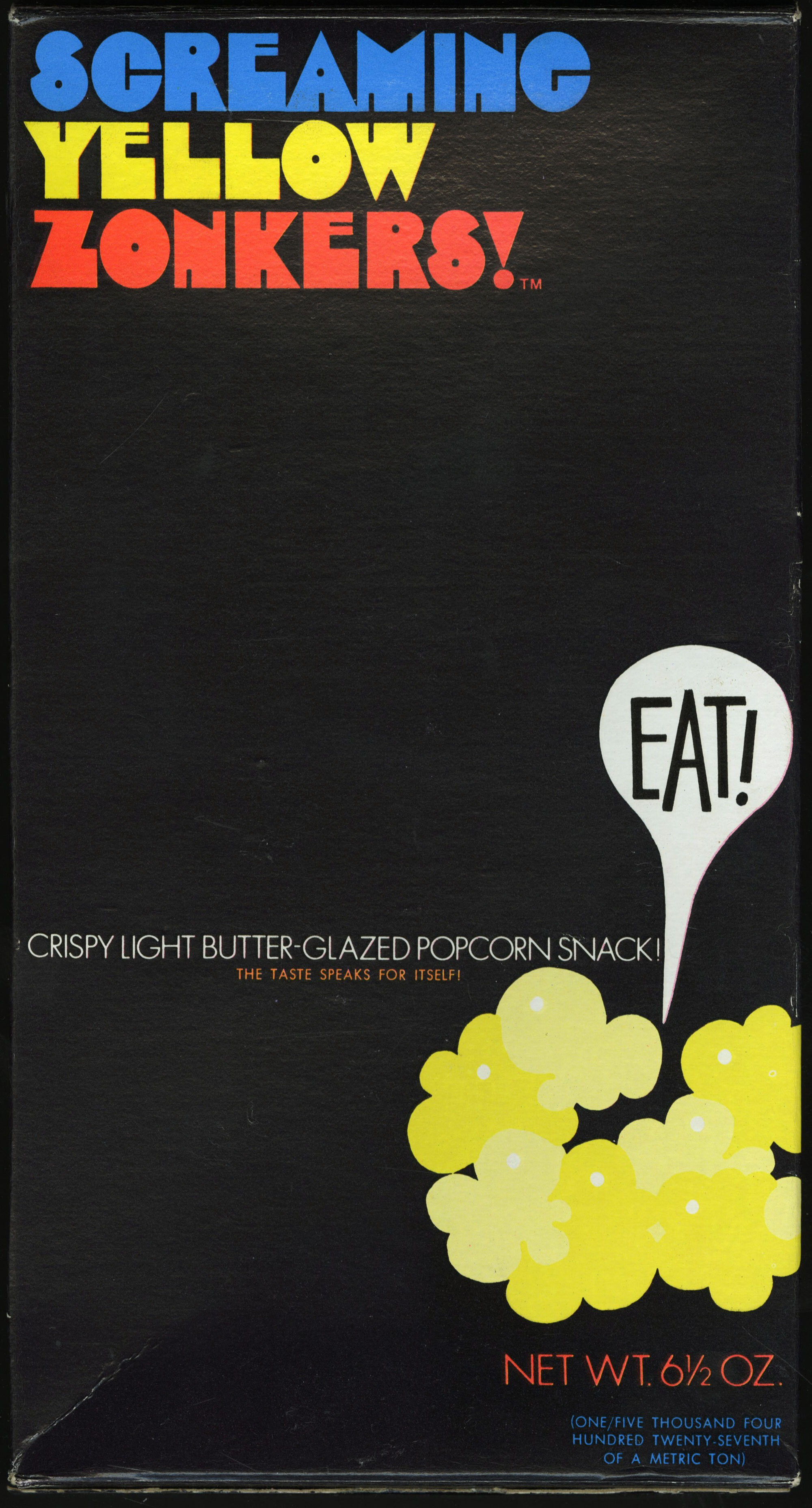
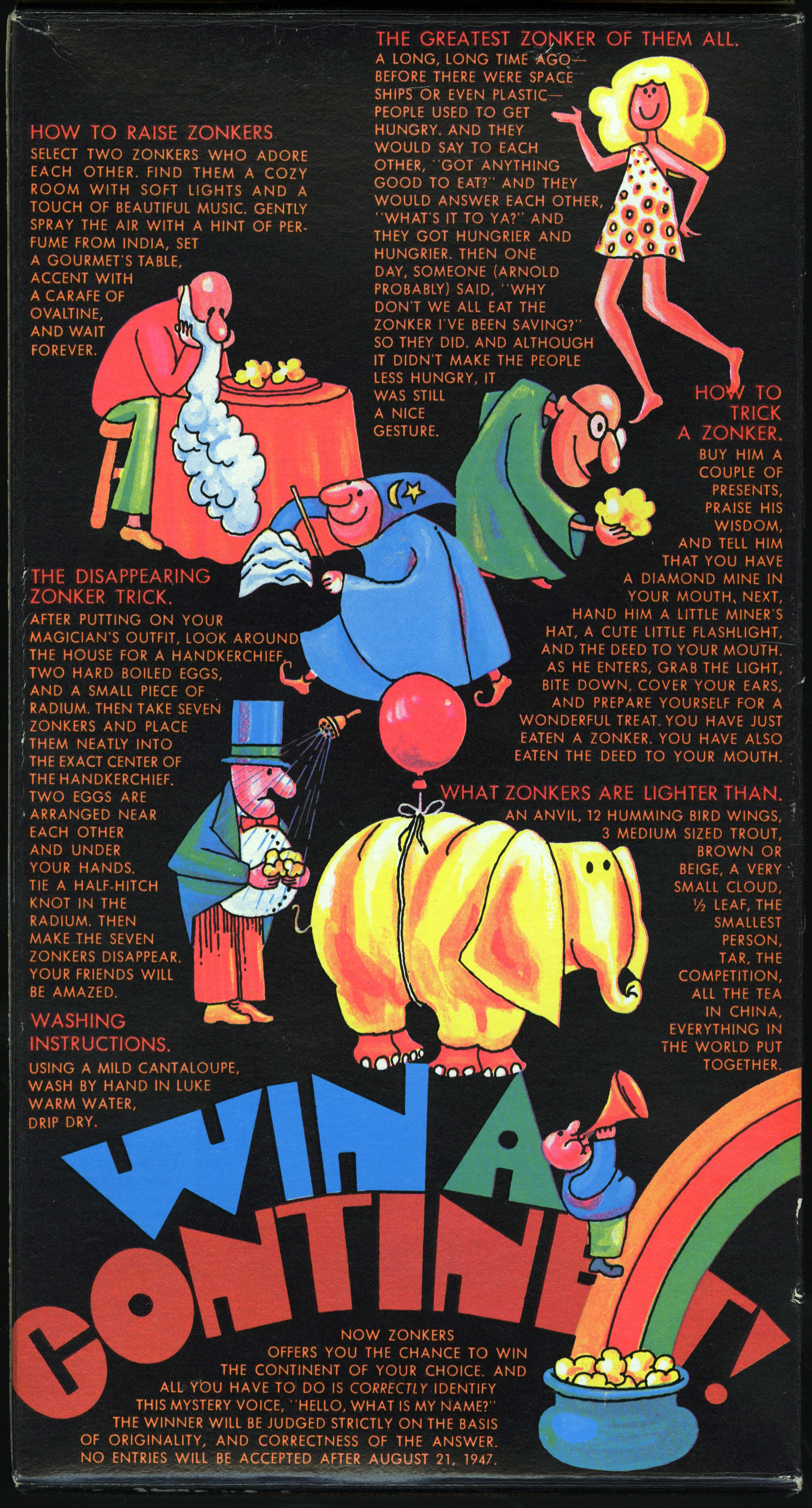
Screaming Yellow Zonkers ☜
I can at least partially trace my love for graphic design and typography back to childhood, tagging along with my mom on grocery shopping trips. The visually striking packaging on the store shelves fascinated me, but one design in particular left a lasting impression: this wonderful Zonkers box, designed by Rollin Binzer. It was one of the first times I recall becoming aware of the power of a great composition, and I coveted the box as much as its contents. Lincoln Snacks, circa 1970.
The hero typeface here is Craig Mierop’s Ginger Snap. (Thank you for the lead, Ryan!)


